

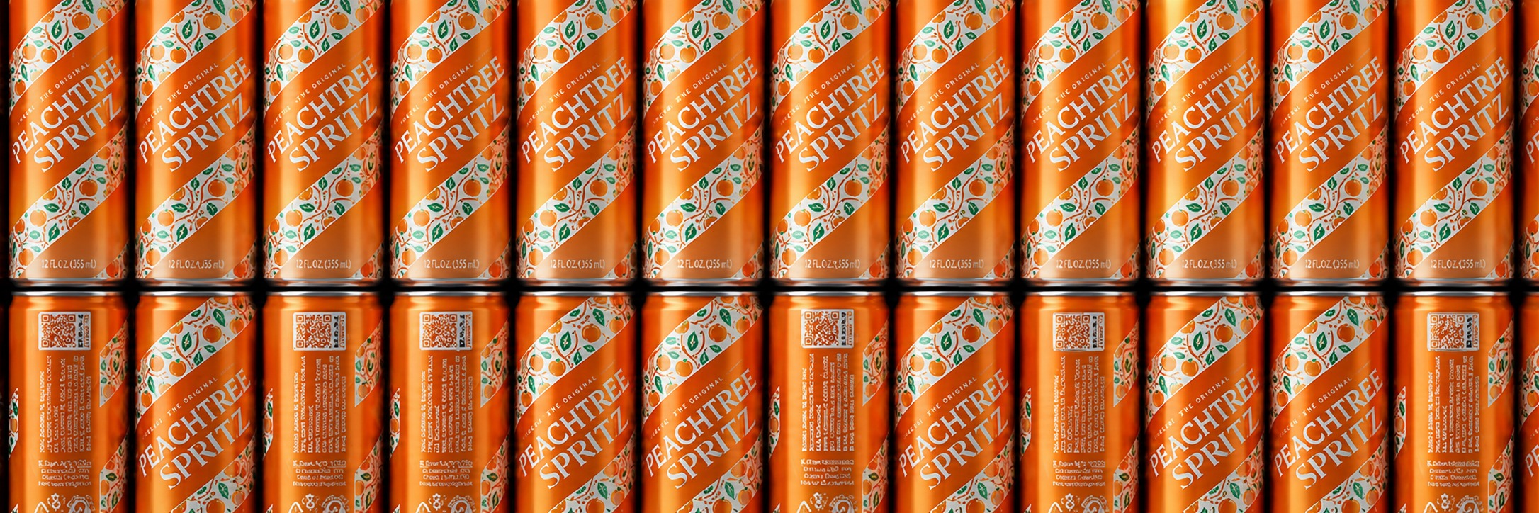
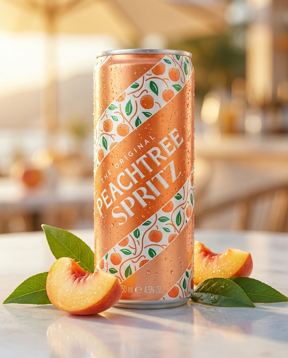
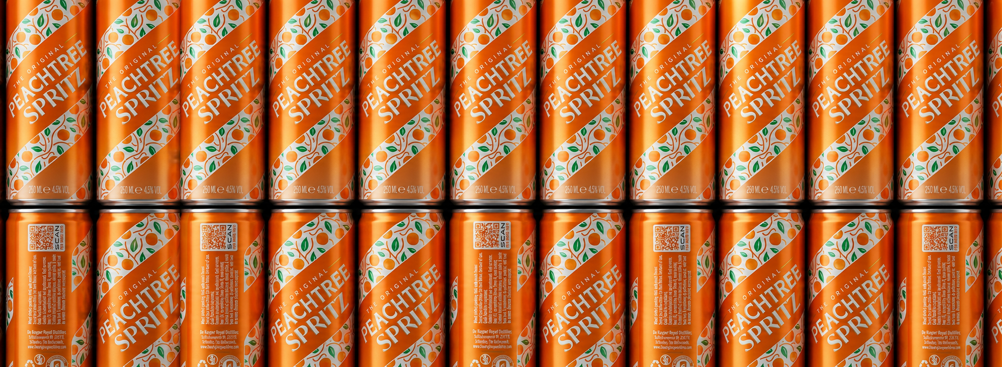
For Peachtree Spritz we wanted to connect origin and consumption in one clear visual idea. Peaches grow in orchards with trees in neat rows and open paths between them. That rhythm became the can: the white diagonal bands represent the rows of peach trees, while the orange diagonals represent the paths running through the orchard.
But the spritz serving moment demanded equal attention. A spritz is served in a large glass with ice and a striped paper straw — white and orange, with a distinctive diagonal twist. That visual has become a category cue. So in a direct move, we turned the can itself into that straw. The diagonal striping signals refreshment, summer and easy drinking before a word is read.
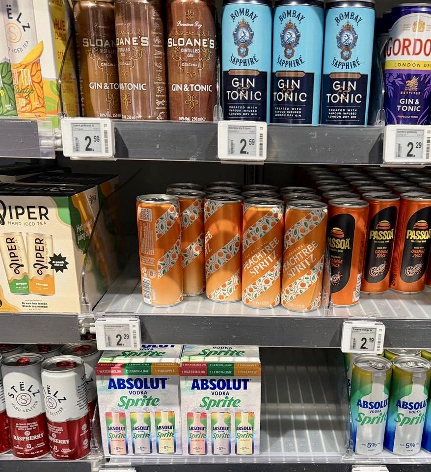
The Peachtree illustration from the bottle was reworked with fresher green leaves — lighter and more summery, reinforcing the orchard concept. Maximum logo contrast ensures shelf readability from any angle, even when cans are turned or not perfectly aligned.
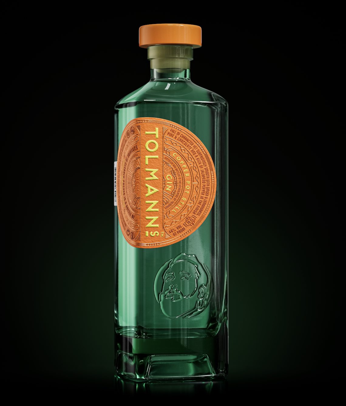
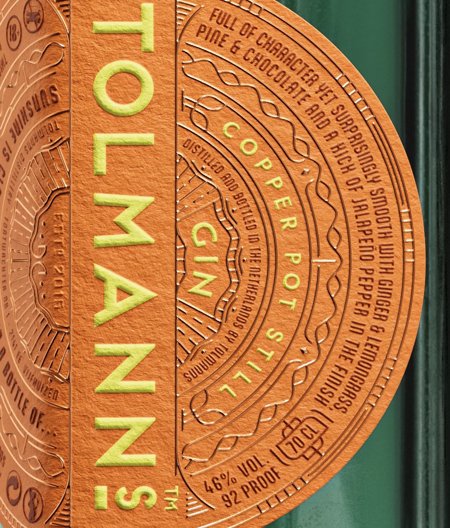
The gin category had grown crowded. Tolmanns needed a redesign with a capital R — one that would relaunch the brand with full conviction at ProWein 2025. The sun became the central architecture. A new square bottle from Wild Flint Glass (Estal) was chosen for sustainability and the natural greenish tint of the glass — immediate contrast against the warm, bold label. The circular label emerges from the bottle's horizon, rising as a sun does. Bold, round, radiating outward — with no back label. One surface, the whole story.
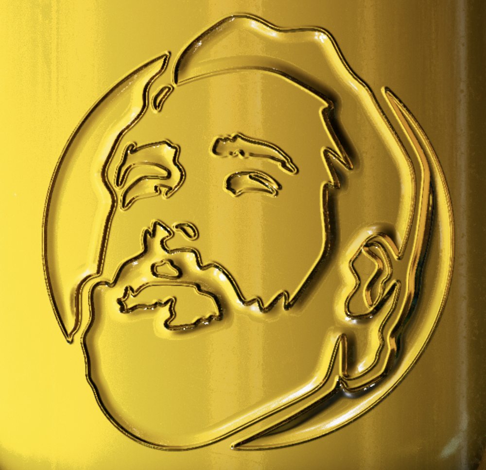
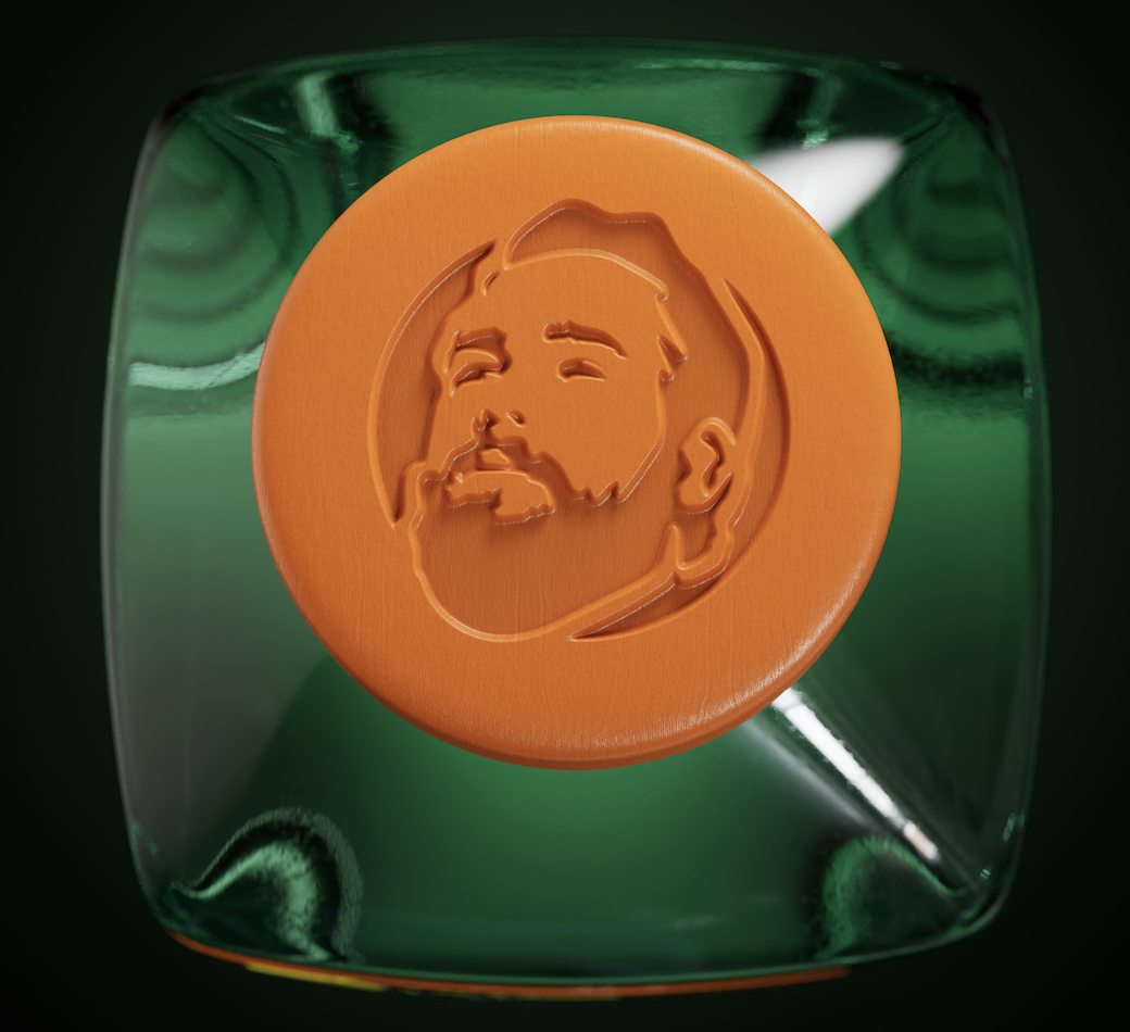
Sixteen botanicals, flavour notes and handcrafted illustrations layer at different heights, creating depth you feel before you read it. Hot foil stamping adds metallic richness. The Master Distiller is honoured with a 3D-printed portrait directly onto the glass, simulating an embossing. Label: Avery Dennison · Print: Reynders · Foil: Leonhard Kurz · Bottle: Estal

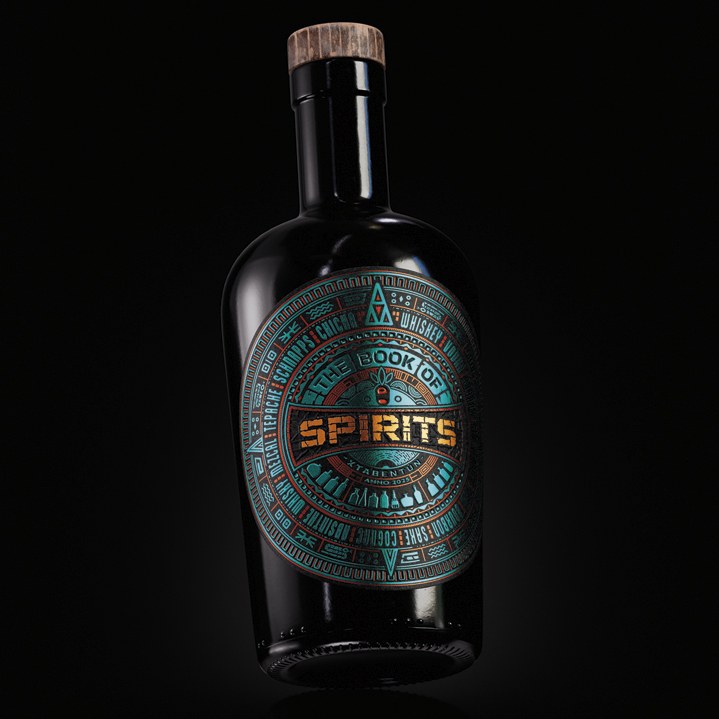
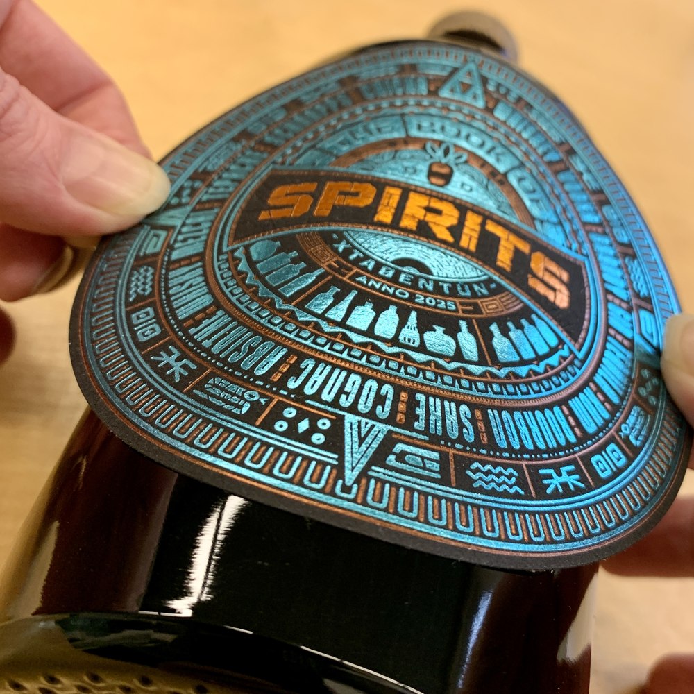
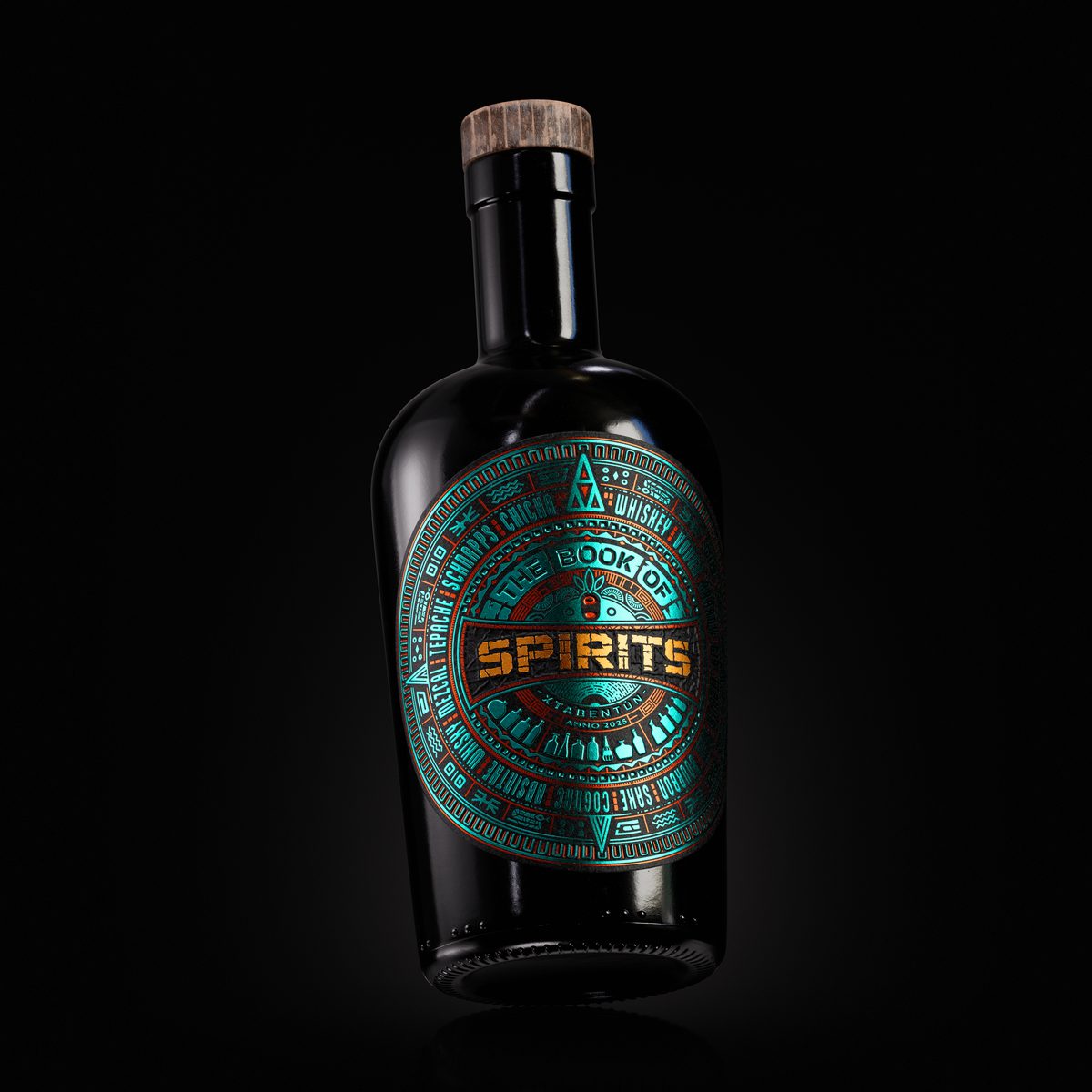
The Book of Spirits documents ten packaging design and production cases across 2025 and 2026, culminating in a physical book with 500 printed copies and real produced labels. For the opening case, VHD chose Xtabentún — a Mexican liqueur rooted in Mayan tradition, made from anise seeds, fermented honey and rum. The Mayan sun calendar became the design system: one year, four seasons, 365 days encoded in one circular label.
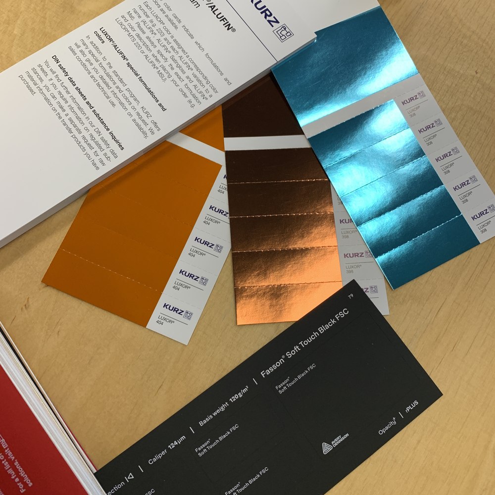
Three Leonhard Kurz hot foil colours — teal, copper and orange — shimmer across the surface, each representing a different production partner. A debossed texture adds further depth. The more you look, the more you find.


Every partner contributed their most responsible materials: Estal DA CLARIOR bottle in 100% recycled Wild Glass, Avery Dennison Fasson Epique FSC uncoated paper, and Leonhard Kurz LUXOR 232 foil thin enough to be recycled with the paper.
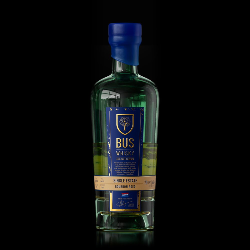
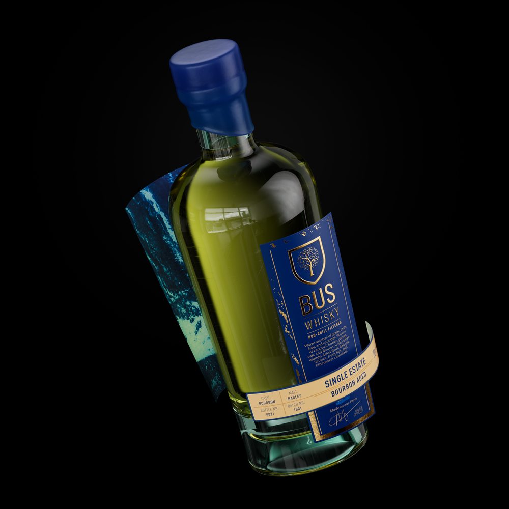
The standout technique is Vitrophany — artwork printed on the paper first, adhesive applied on top, so the illustration is visible from inside the bottle through the glass. The whisky's colour and the label illustration merge into one visual. A liquid lens that only reveals itself fully when the bottle is filled.
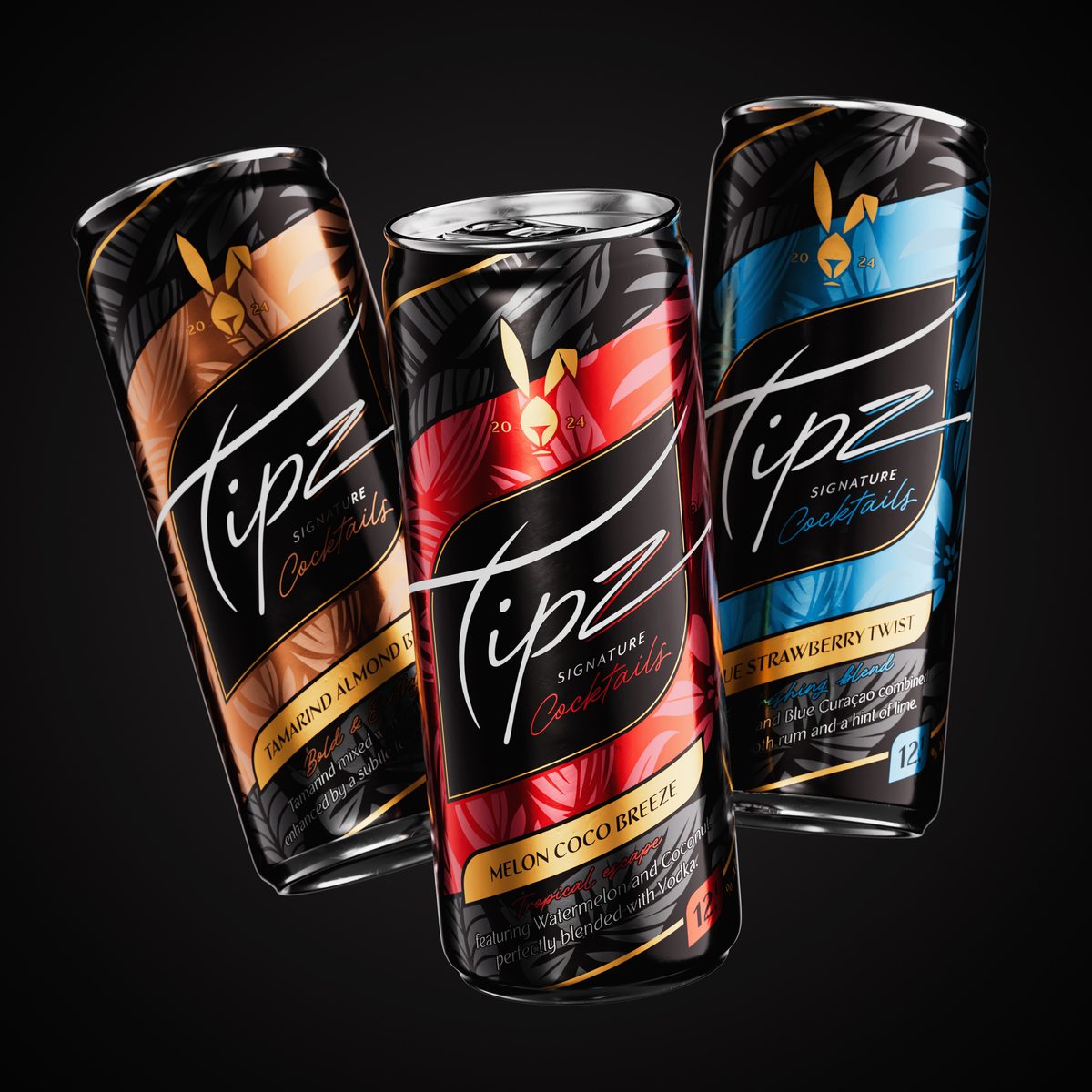
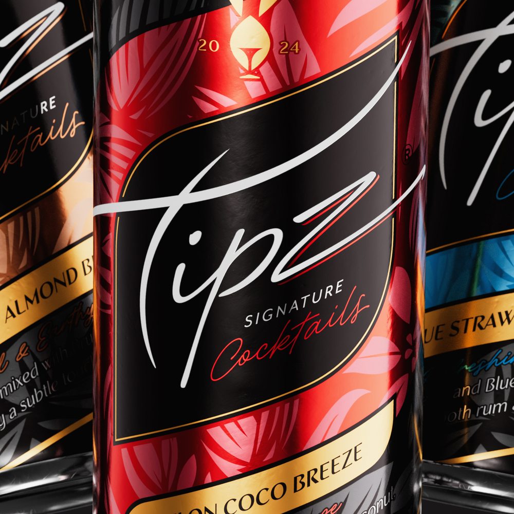
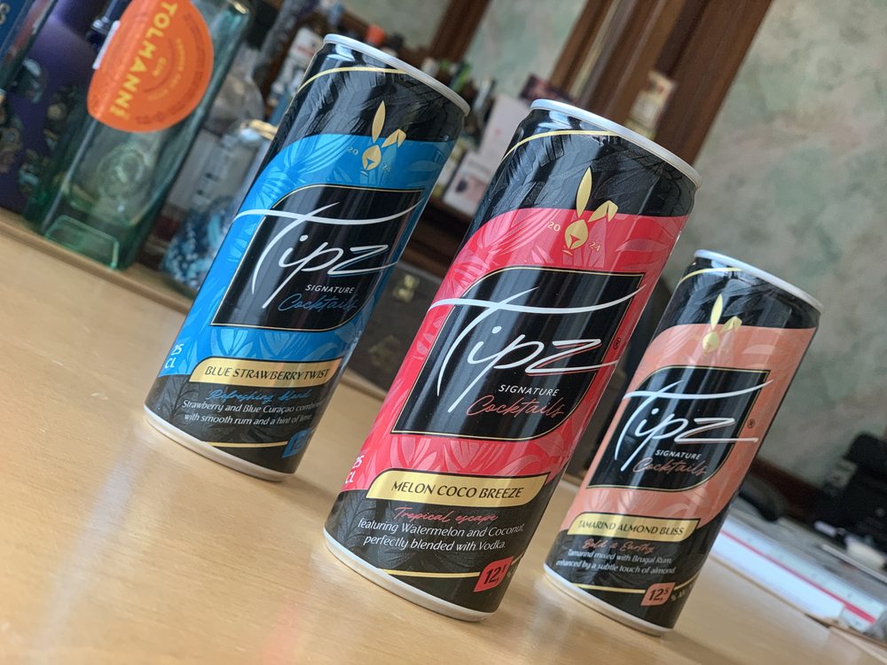
The obvious move would have been fruit illustration. We stepped away from it. Instead, we developed tropical illustration as a design language: dark, layered, botanical. Colour carries the flavour story; the illustration sets the premium register. The aluminium itself becomes a design element, metallic surfaces contrasting against opaque areas for depth and a premium in-hand feel.
Flavours: Blue Strawberry Twist · Melon Coco Breeze · Tamarind Almond Bliss.
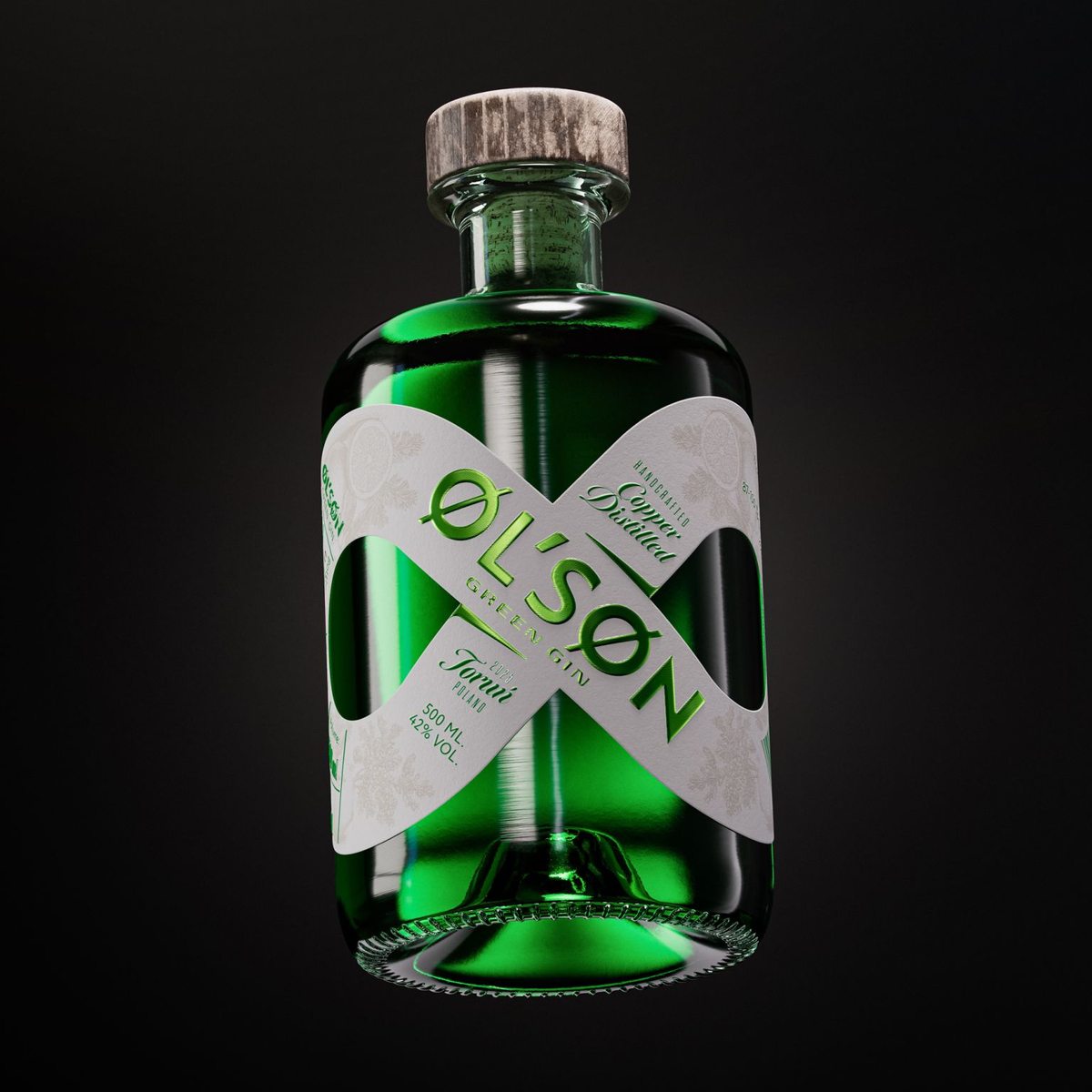
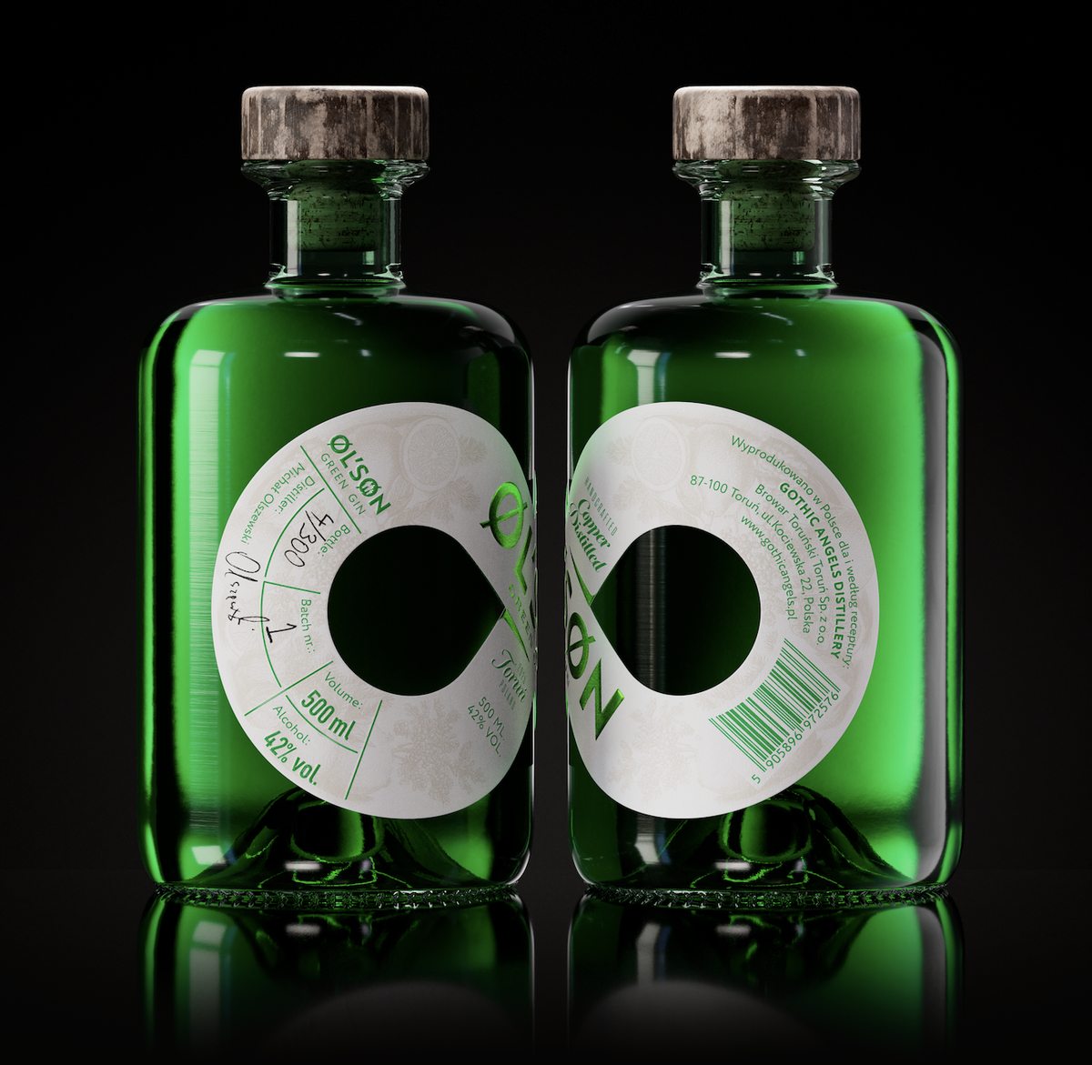
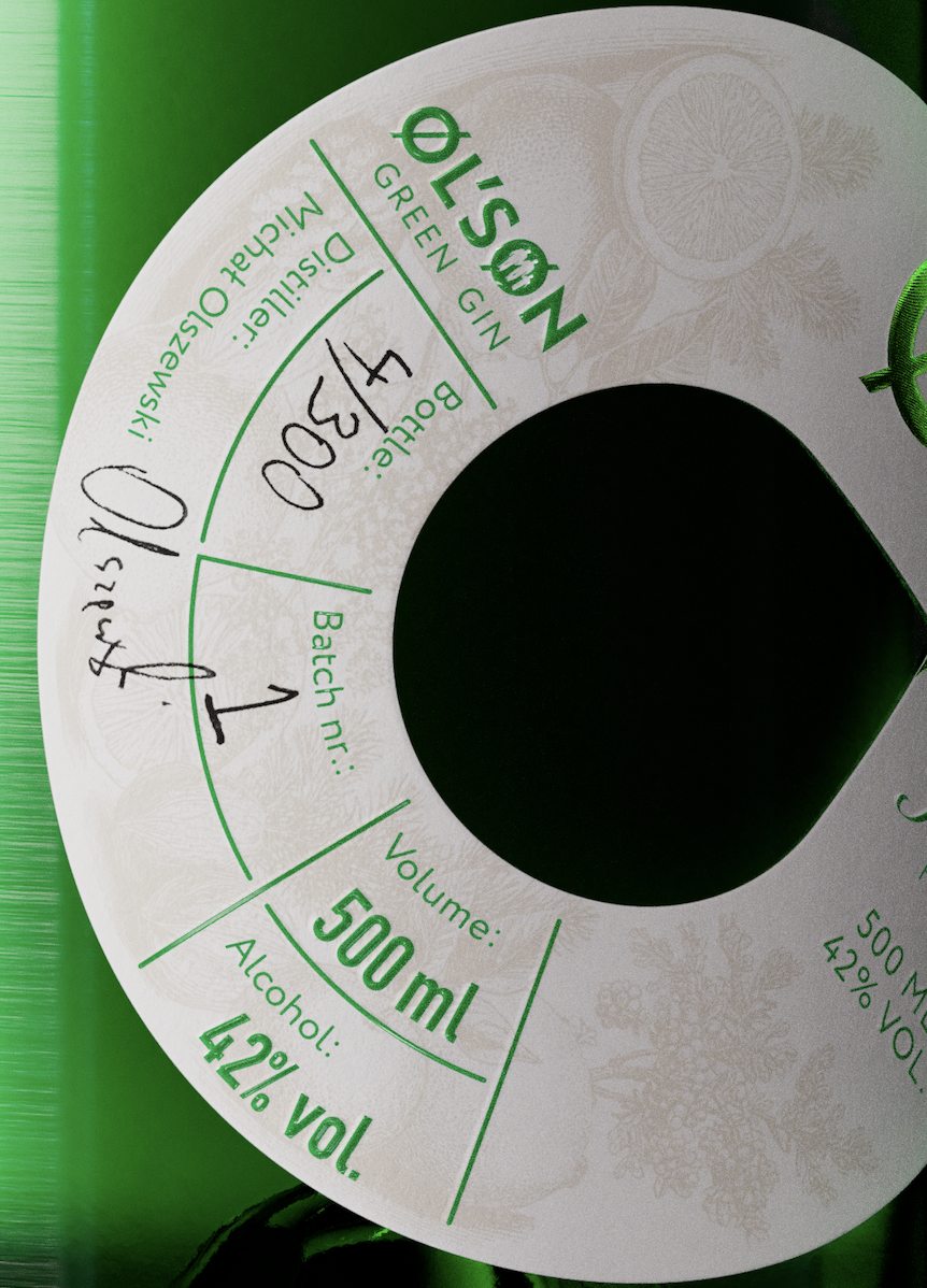
The label is shaped as an infinity symbol — a seamless loop carrying the full story without separation. The bottle is 100% recycled wild glass. The label is printed on recycled paper containing 15% apple residue. The Leonhard Kurz hot foil is fully recyclable together with the paper.
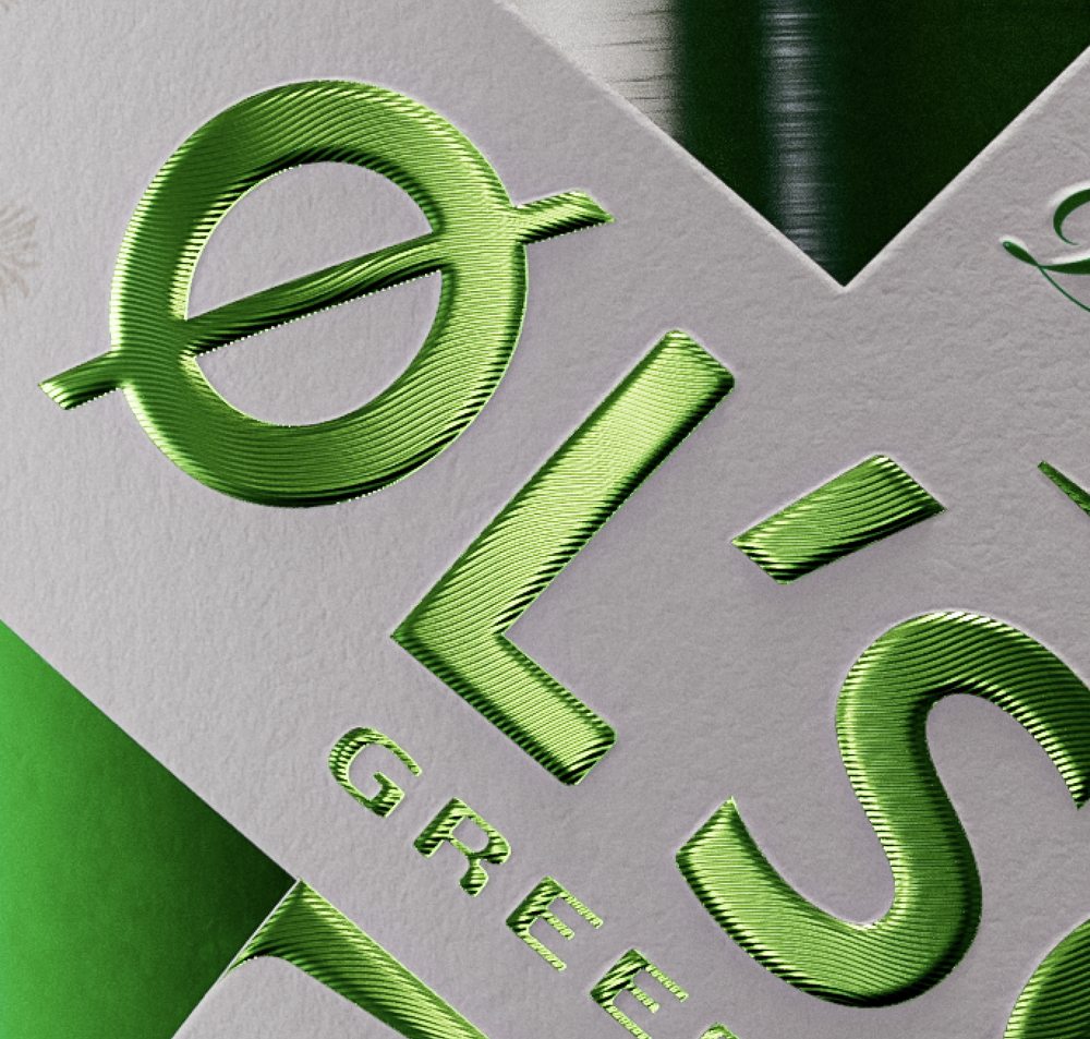
For the logo, a special pattern micro-embossing with green hot foil — a texture that changes with light. The cork is branded inside with either X or O — collect enough and you have your own Tic-Tac-Toe set, with a subtle smoked note added to the gin as a bonus.

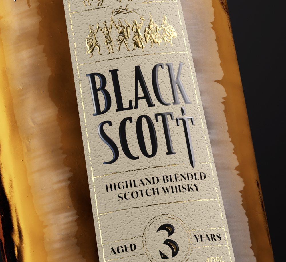
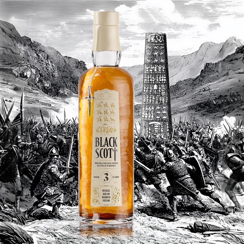
We used the Sueno's Stone directly. The bottle shape references the Stone. The label shape replicates its front silhouette. The illustrations — knights on horseback, foot soldiers, a one-armed warrior, a riderless horse — drawn from the actual battle scenes carved into the Stone. The bridge beneath which the king was buried sits at the top of the label. The complete legend told without words.
The BLACK SCOTT logo is embossed flat throughout — except for the final T, which rises to a sharp point. A sword tip, for the trained eye only. A miniature cast metal dagger hangs from the neck of every bottle.

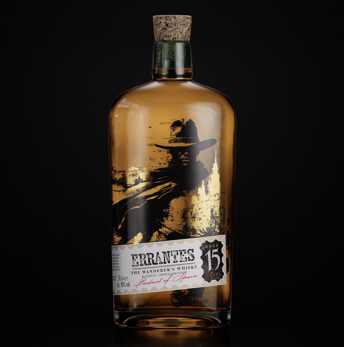
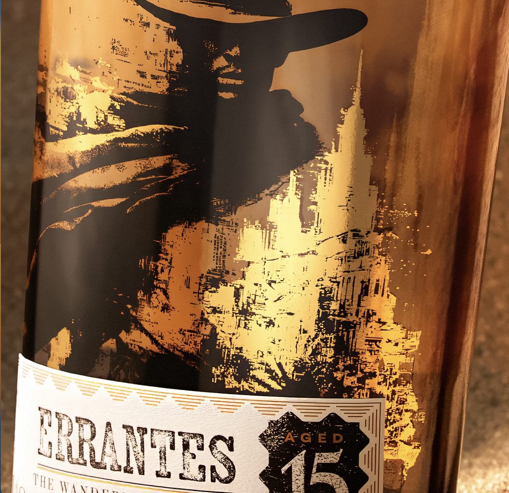
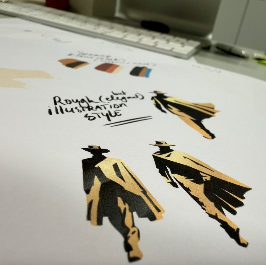
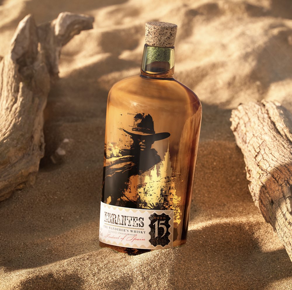
Built for the Asian premium market, the brief demanded a visual identity that spoke through mood and atmosphere. The illustration is printed directly onto the glass — the whisky and the protagonist become inseparable. Direct bottle printing allowed us to push detail and scale in ways label printing cannot. Gold tones approach the richness of real foil.
The label itself is intentionally calm — where the illustration carries intensity and emotion, the label acts as an anchor, holding the brand name and framing the story rather than competing with it.
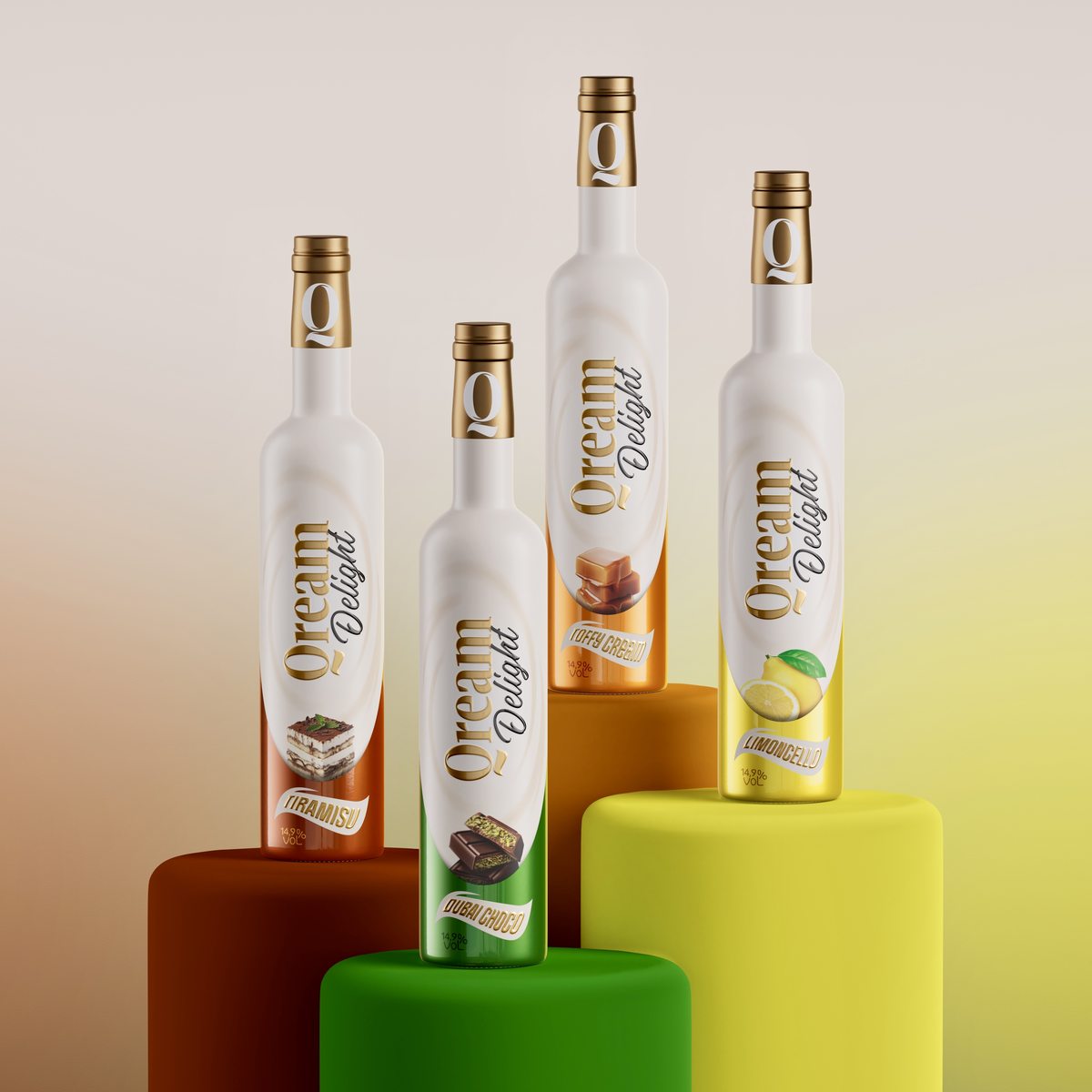
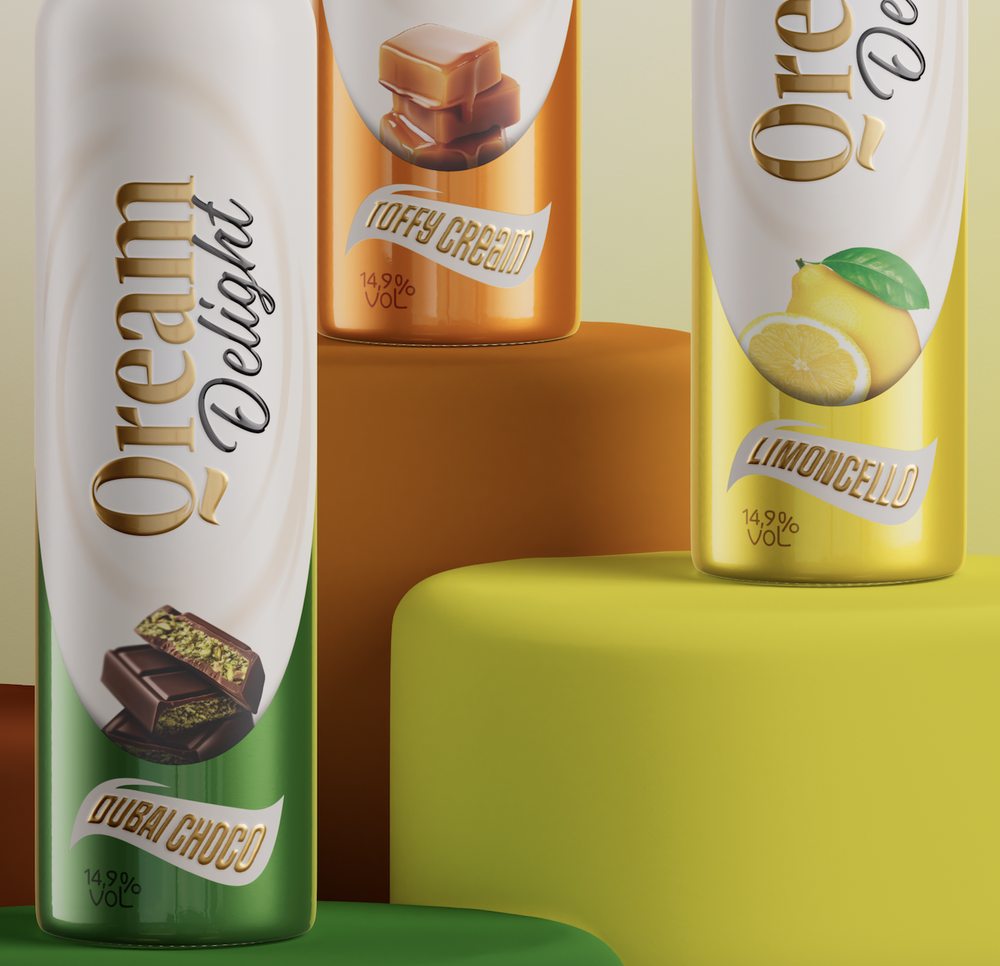
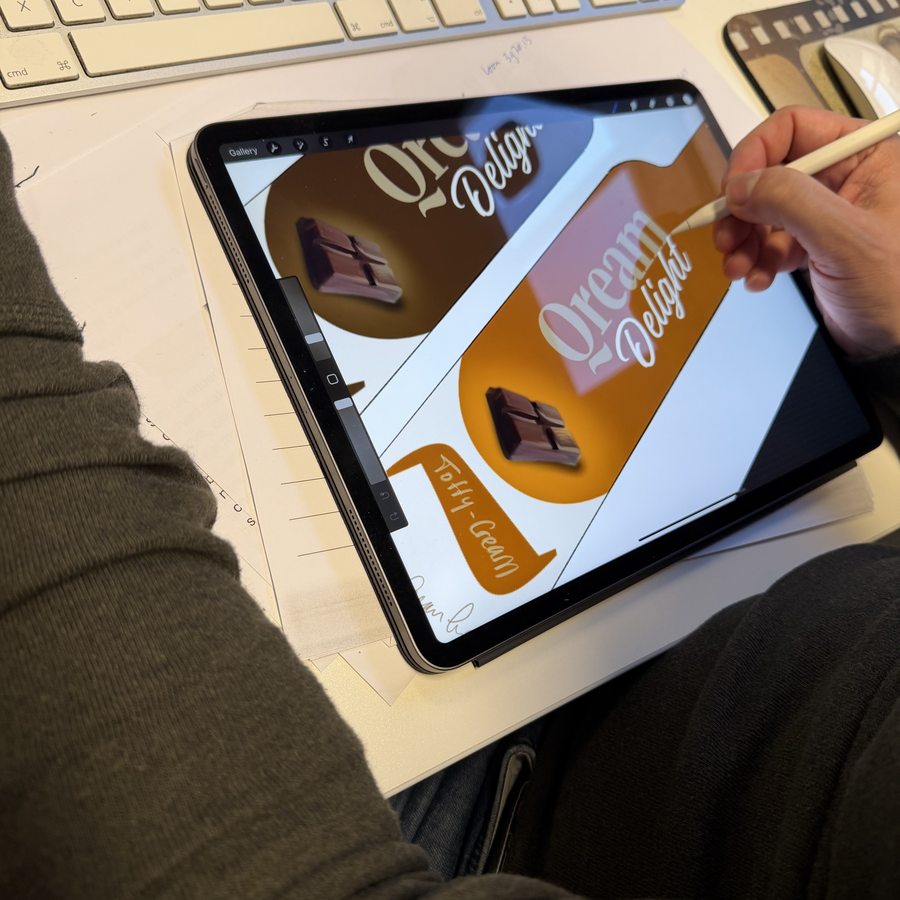
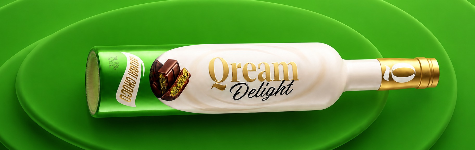
The range — Tiramisu, Dubai Choco, Toffy Cream and Limoncello — built entirely through sleeve printing. A matte varnish forms the soft base layer. A gloss uplifting varnish on the logo and flavour elements creates a subtle relief, simulating embossing with greater precision. The large hot foil surface starts on the lower front and continues across the entire back, with flavour photography sitting behind the foil layer for depth.
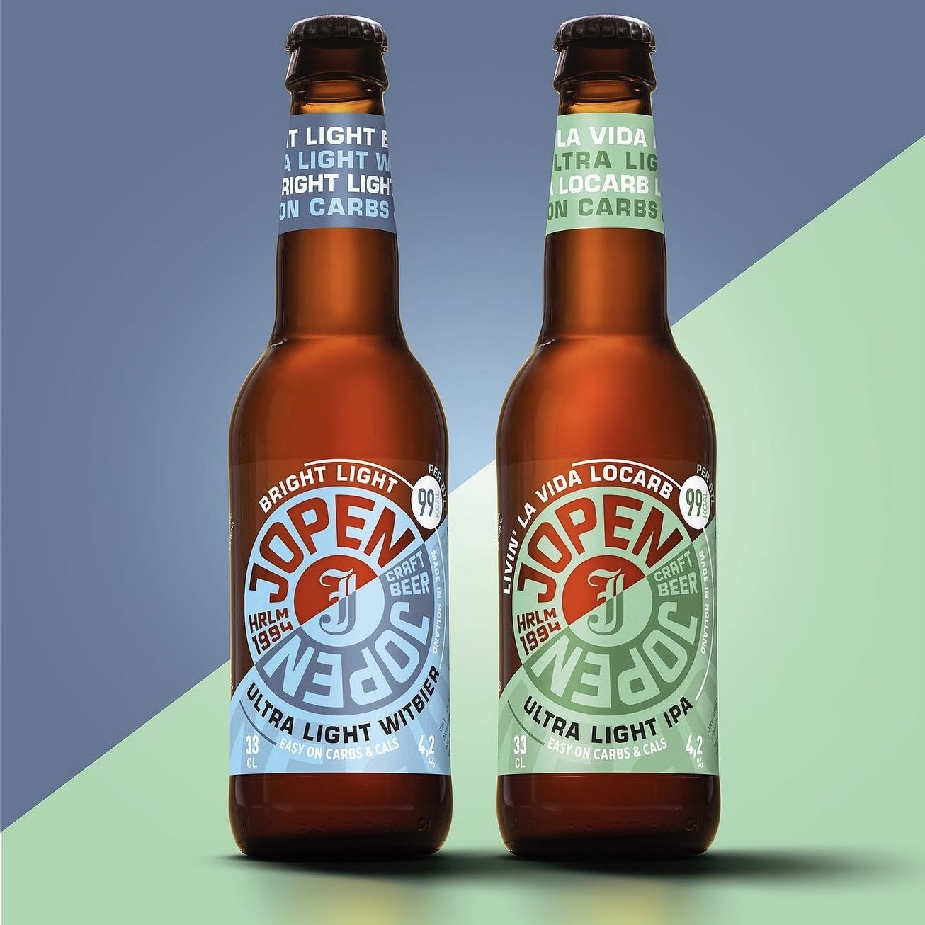
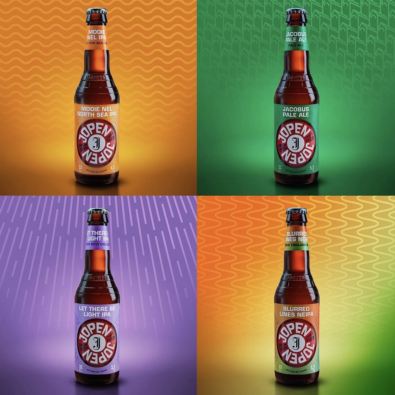
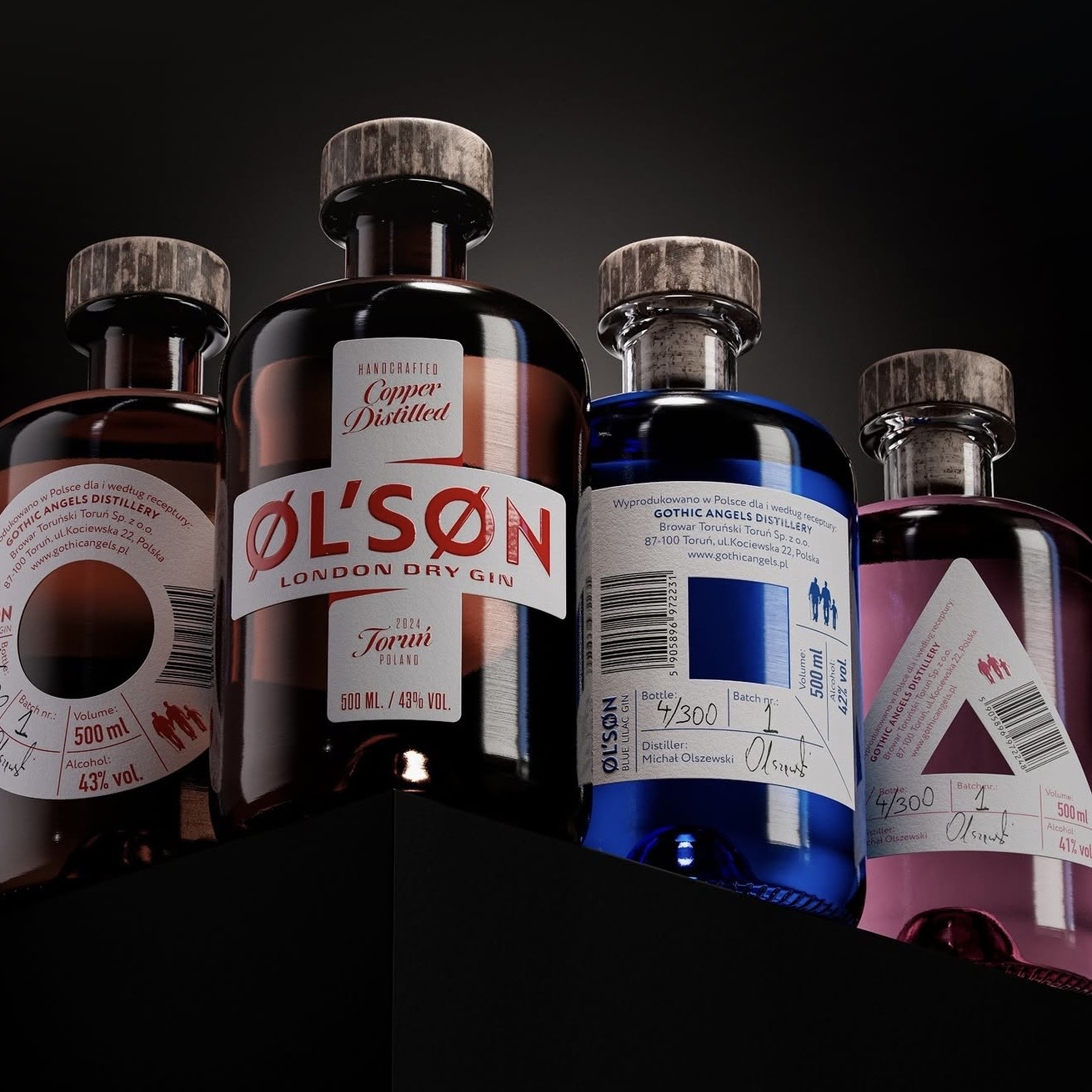
Four variants — individual in character, unified in system.
VHD is a boutique drinks packaging agency. For over 50 years we have been translating brand strategy into physical packaging — for spirits, RTD, FMCG beverage and high-end drinks worldwide.


We do not create something that is simply nice. Every design decision must support the concept, the story, the drinking moment and the shelf presence — simultaneously. That is the standard we hold ourselves to, on every project, for over fifty years.
VHD lives inside the drinks category. Not packaging in general — drinks specifically. Spirits, liqueurs, RTD, cocktails, 3D bottle shape development, labels, sleeves, finishes, foils, shelf impact and production constraints. That is our daily context.
VHD operates as the central hub between you and every specialist you need to bring a packaging concept to life. We connect brand owners directly to the right international production partners — from bottle to label, from foil to closure — and manage the flow between every step.
Whether you already have suppliers or need new ones, we work with both. Our role is to make the process seamless: design, production knowledge and partner network — all in one conversation.
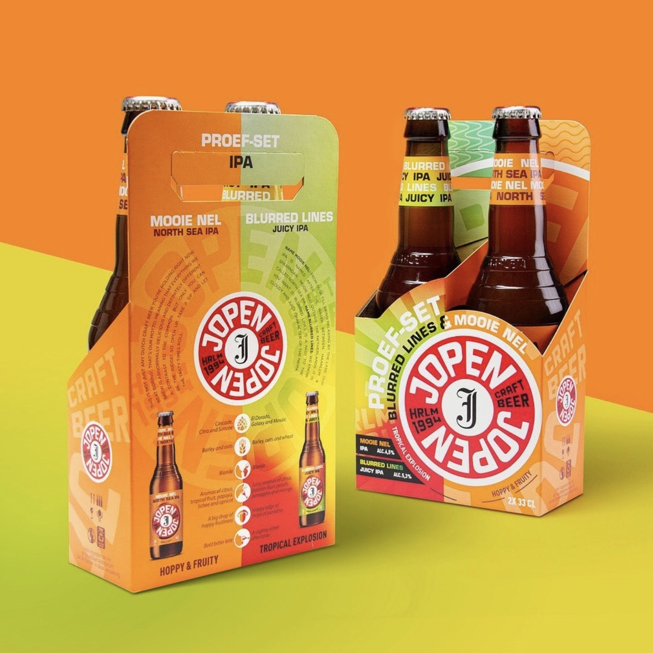
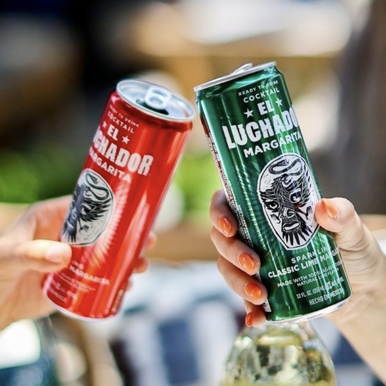
RTD is where spirits brands
risk losing equity.
We help translate it properly.